Holy Greens
Eating fast, good and healthy should be straightforward.
Client
Holy Greens
Year
2019-03-28T12:51:30+00:00
Agency
Guts & Glory
Role
Tech


Holy Green Salad Bar Website: A Case Study in Rebranding and Website Development
Introduction:
Holy Green, a popular salad bar in Sweden, underwent a rebranding in 2017 and required a new website that aligned with their fresh brand identity. Previously, they relied on other online ordering websites provided by food delivery providers. To create a cohesive brand experience, a requirement gathering session was conducted in collaboration with a digital designer. The process began with the development of a new visual identity. As a natural progression, the team embarked on the development of a new website and mobile app. While we handled the website development in-house, the app development was a joint effort with Leeroy in Stockholm, where they focused on the technical aspects while we contributed to the design and user experience.
Rebranding and Visual Identity:
The rebranding process for Holy Green involved redefining their brand identity to reflect their values and appeal to their target audience. Collaborating closely with the digital designer, we developed a new visual identity that encompassed the essence of Holy Green - freshness, health, and sustainability. This included creating a new logo, color palette, typography, and other visual elements that would be carried through to the website and app.
Website Development:
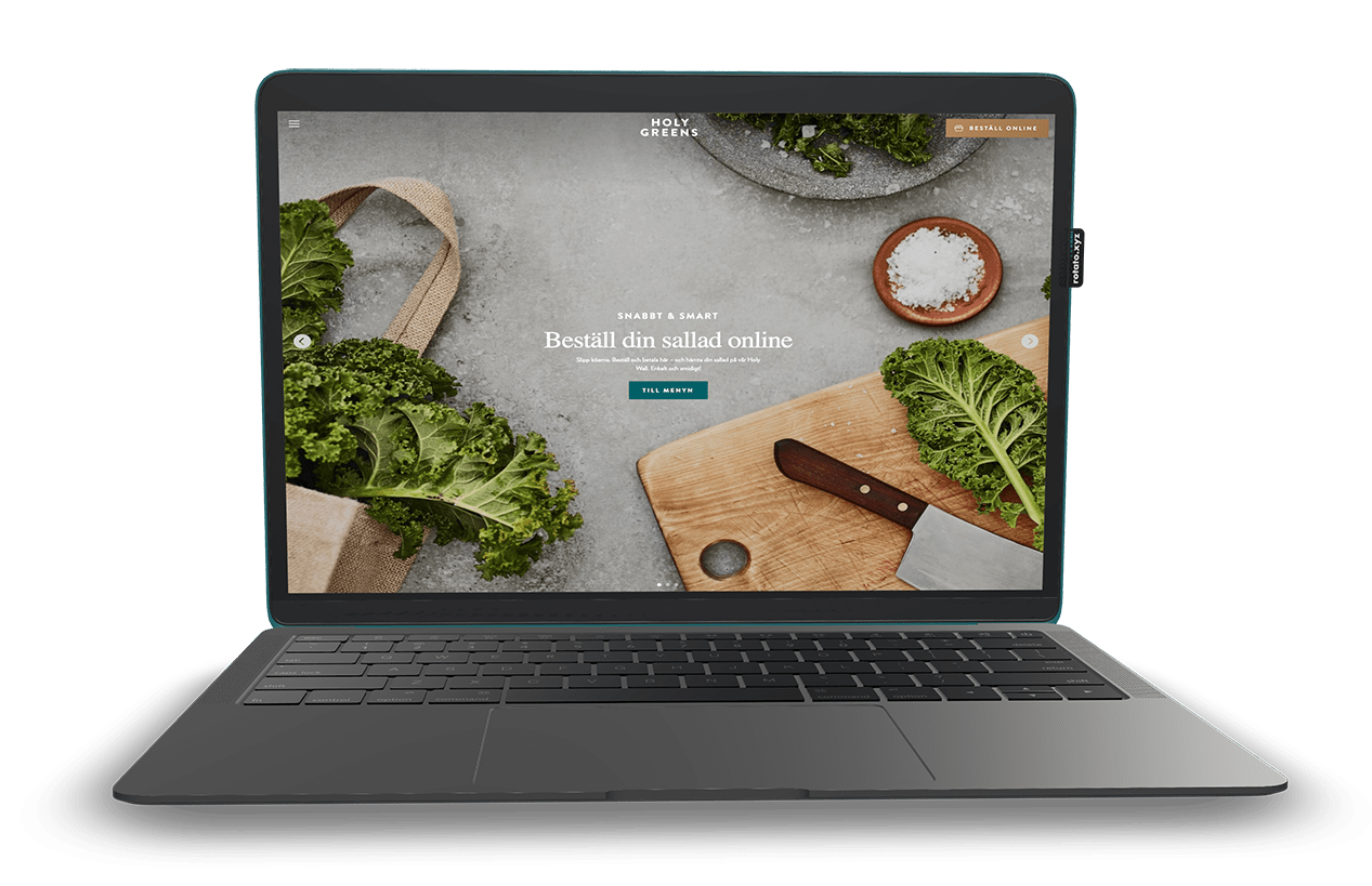
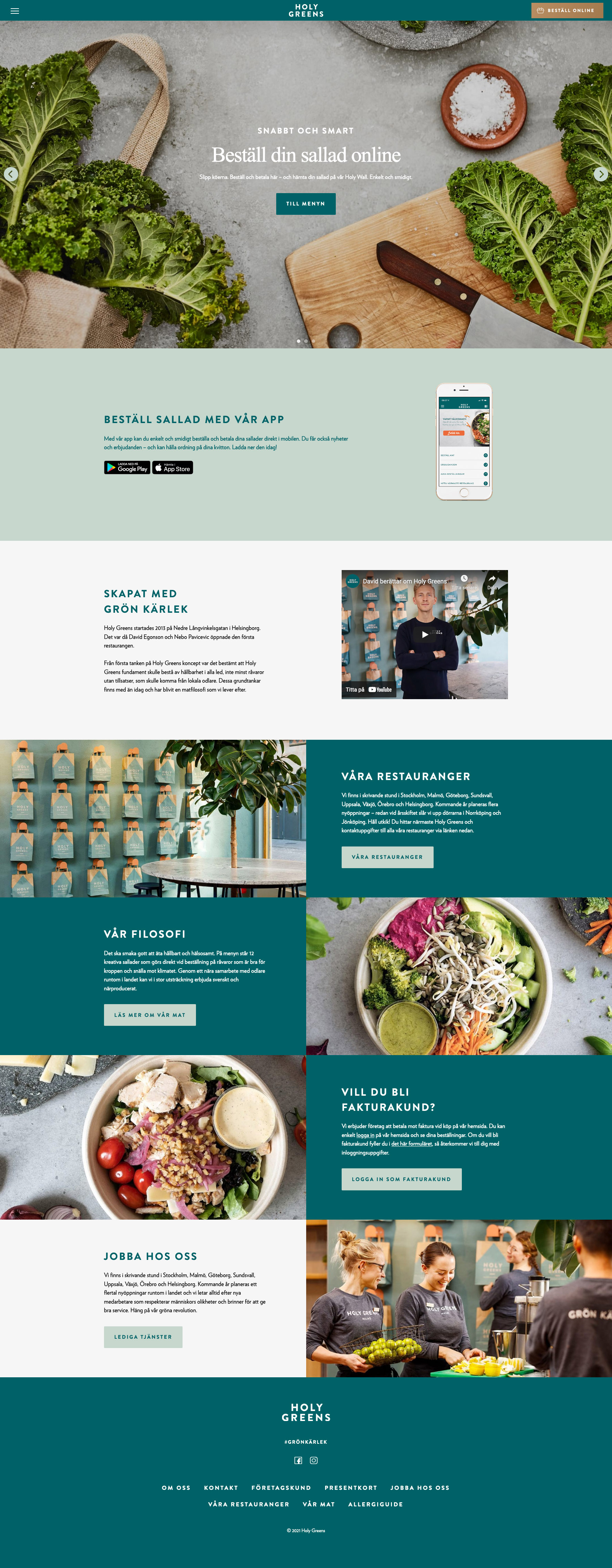
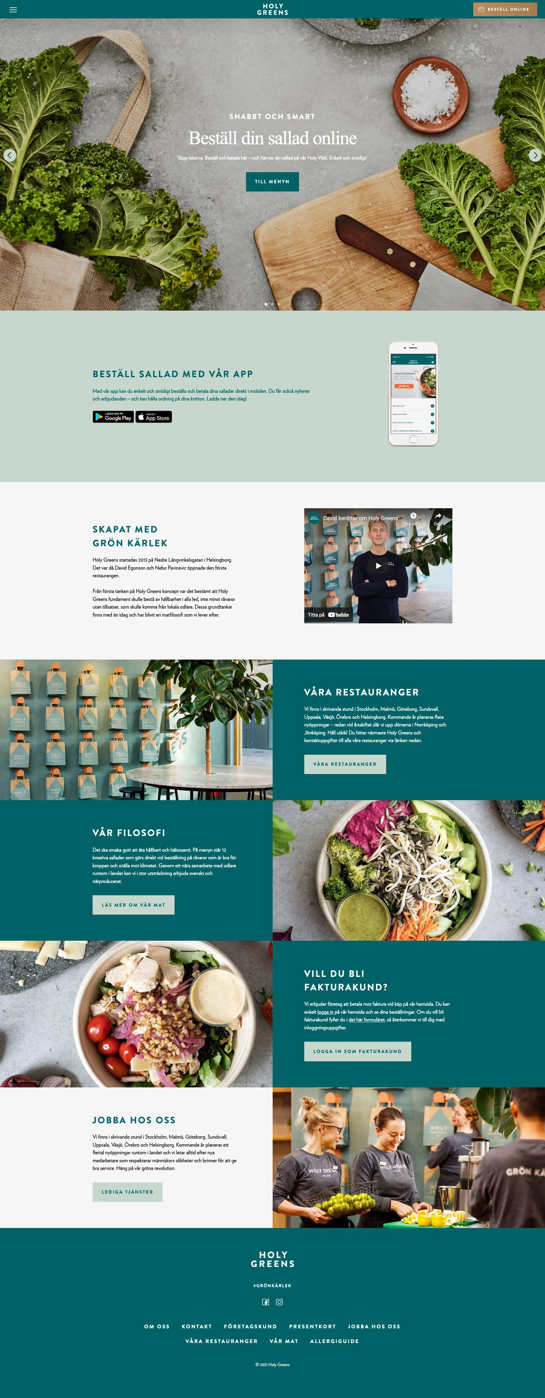
With the new visual identity in place, our team focused on developing a website that embodied the Holy Green brand. The website served as a central hub for customers to explore the menu, learn about the brand's philosophy, and place online orders. We paid careful attention to the user experience, ensuring seamless navigation, intuitive ordering process, and responsive design to cater to different devices. The website became a showcase of Holy Green's offerings and provided a convenient platform for customers to interact with the brand.
App Development in Collaboration with Leeroy:
To complement the website, we collaborated with Leeroy in Stockholm to develop a mobile app for Holy Green. Leeroy was responsible for the technical implementation, while our expertise in design and user experience contributed to creating a visually appealing and user-friendly app. The app provided customers with a seamless ordering experience, allowing them to browse the menu, customize their salads, and conveniently place their orders for pickup or delivery. The collaboration between our team and Leeroy resulted in a cohesive brand experience across both the website and the app.
Conclusion:
The development of the Holy Green Salad Bar website and app showcased the successful collaboration between our team, a digital designer, and Leeroy. Through the rebranding process, we crafted a fresh visual identity that reflected the essence of Holy Green. The website and app became essential touchpoints for customers, providing an intuitive and convenient platform to engage with the brand, explore the menu, and place orders. This project not only demonstrated our expertise in website development but also highlighted the value of collaboration in delivering a seamless user experience across multiple digital platforms.


