Lööf Foundation
A clean and responsive website for the Lööf Foundation.
Client
Lööf Foundation
Year
2013
Agency
Whitespace
Role
DesignFront-end
Tech
Bootstrap 3CSSHTMLJavascriptWeb Development

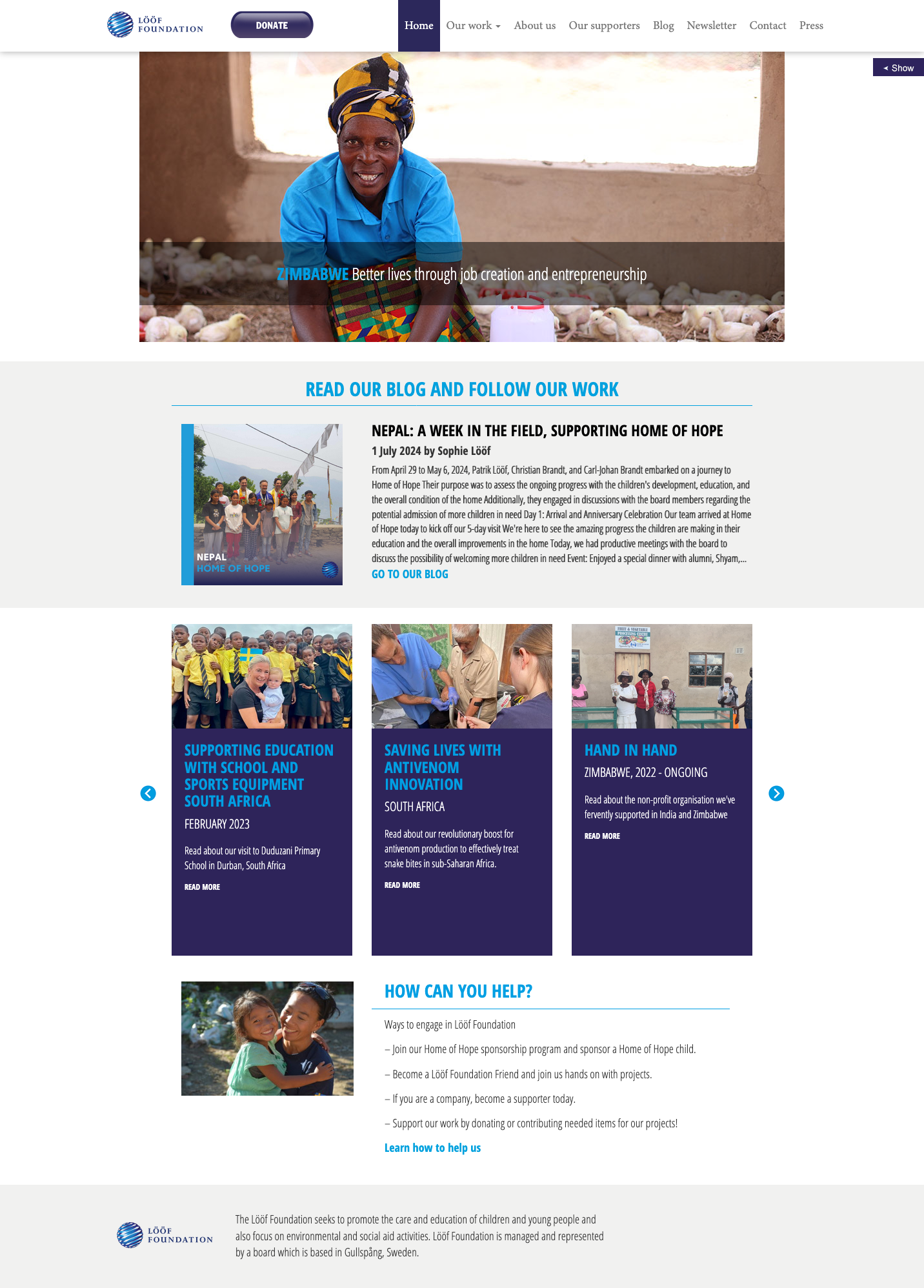
Lööf Foundation: A Responsive Web Solution
Introduction:
The Lööf Foundation needed a responsive and user-friendly website to communicate their mission and projects effectively. My role involved designing and developing the front-end, leveraging Bootstrap 3 for responsiveness and ensuring a seamless experience across all devices.
Key Features:
- Responsive design using Bootstrap 3 for compatibility across various devices.
- Clean and intuitive layout for easy navigation and content consumption.
- Dynamic elements to enhance user engagement and interactivity.
Technologies Used:
- Bootstrap 3: For responsive grid-based design.
- HTML: For structuring the content.
- CSS: For styling and creating a visually appealing interface.
- JavaScript: For adding interactivity and functionality.
Conclusion:
The Lööf Foundation project resulted in a modern and responsive website that effectively showcased their mission and projects. This project highlights my expertise in front-end development and responsive design, ensuring a high-quality user experience.