AtlasBlocks
Premium Shadcn & React components for content-driven websites
Client
Open Source
Year
2026-01-15
Agency
Personal Project
Role
Tech
atlasBlocks
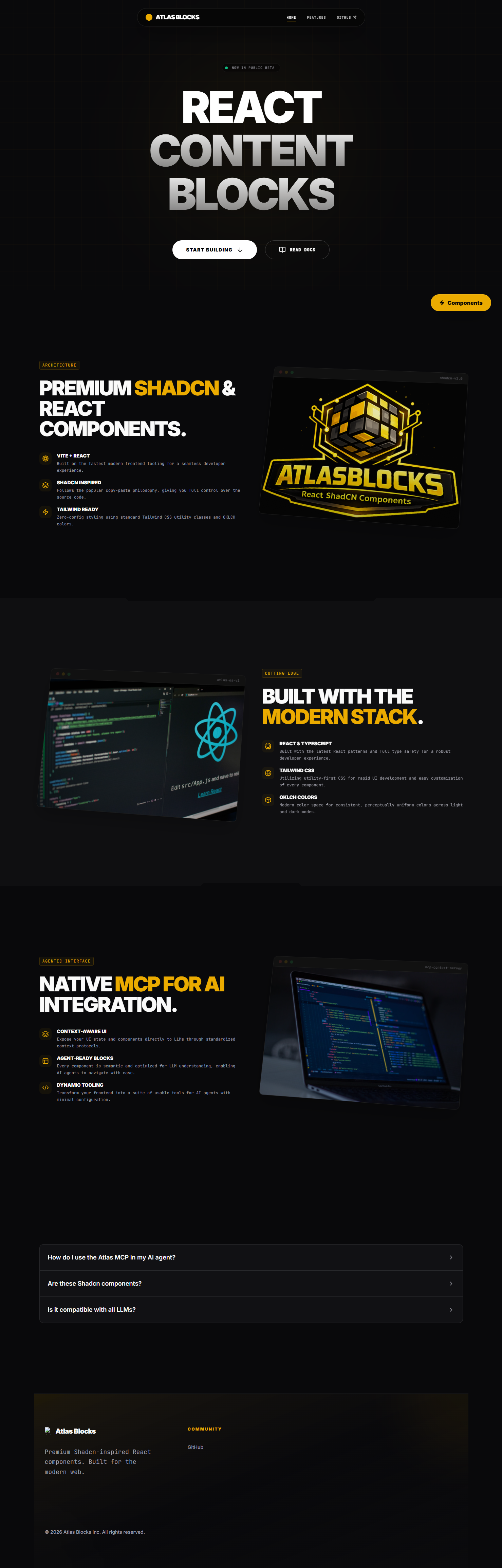
React Content Blocks for Modern Websites
AtlasBlocks provides pre-built React content blocks that accelerate website development. Each block ships as a complete section, ready to install, customize, and deploy.
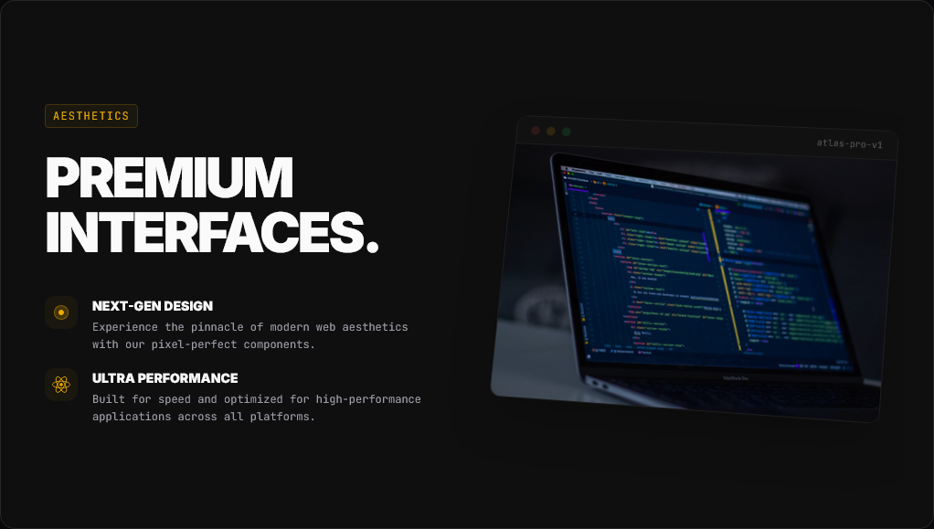
One-Command Installation
Install complete sections directly from the terminal. No copying and pasting code. No manual setup. Each block integrates seamlessly with your React project and follows shadcn/ui conventions.
Content-First Architecture
Built specifically for content-driven sites, landing pages, marketing websites, and product pages. Each block accepts props for content, making it straightforward to populate sections with real data.
Tailwind Theme Integration
Uses Tailwind CSS variables for colors and spacing. Change themes by updating your config file. Blocks automatically adapt to your design system using semantic classes like text-foreground and bg-primary.
MCP Integration
Compatible with AI coding agents through Model Context Protocol. Agents can browse, install, and configure blocks programmatically, enabling automated website assembly with proper context about each component.
Core Capabilities
atlasBlocks focuses on solving a specific problem: assembling content sections quickly without sacrificing customization. Each block is designed to be installed once and modified as needed.
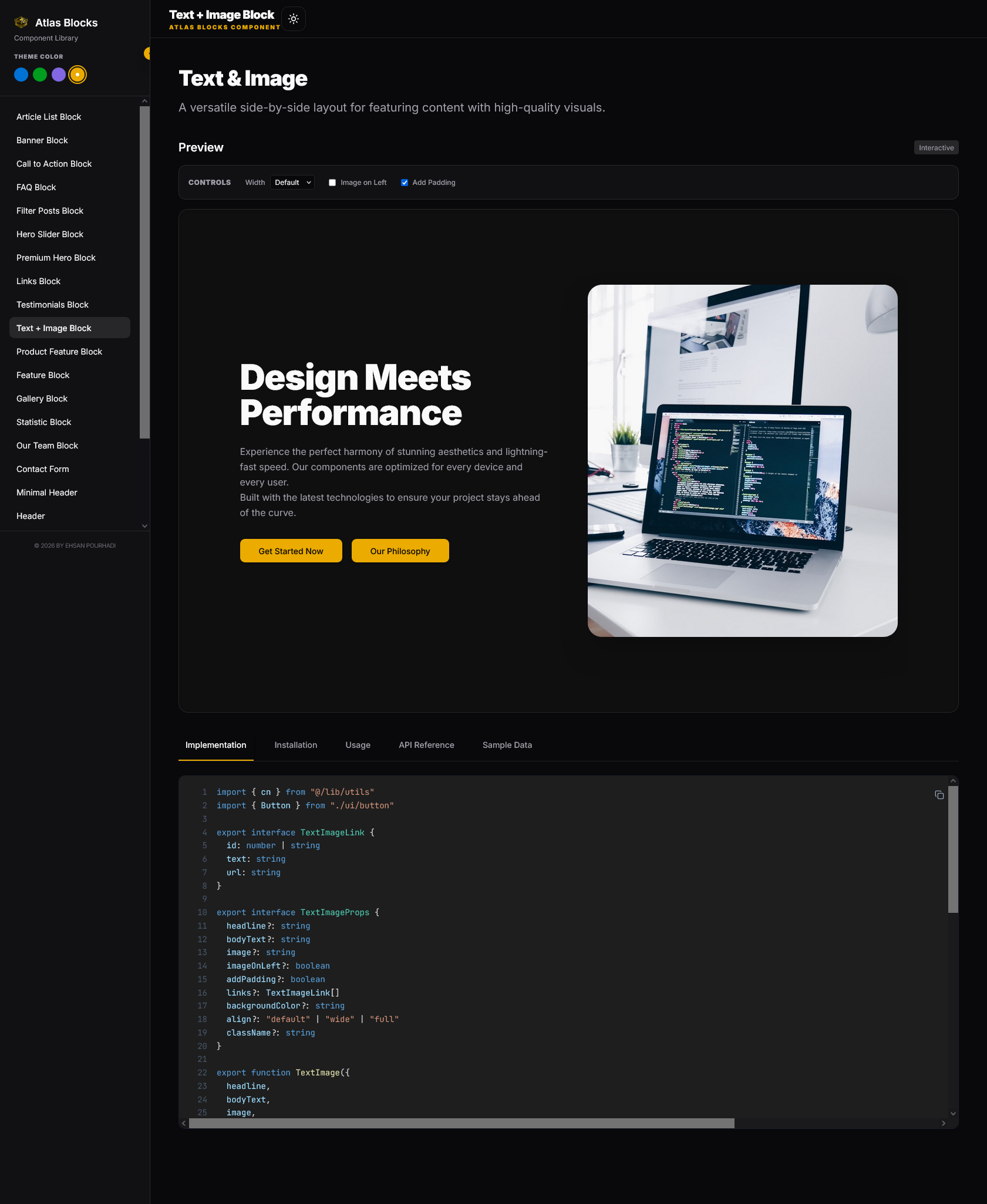
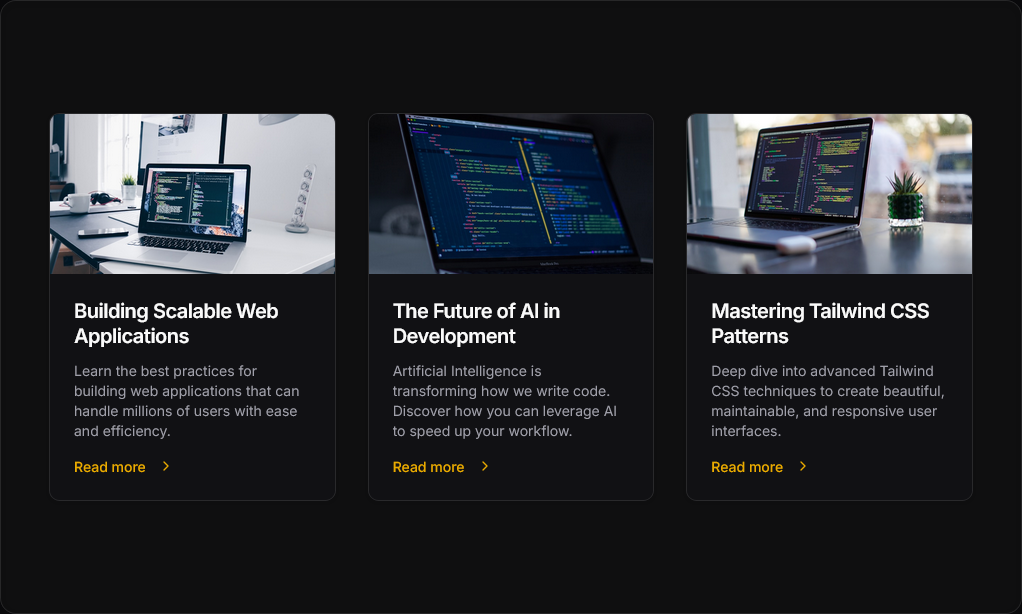
Reusable Section Library Twenty-plus content blocks cover the most common website sections. Headers, navigation, hero sections, feature grids, footers, and CTAs. Each block represents a complete, functional section that works immediately after installation.
Props-Based Content Management Content flows through props, similar to how Advanced Custom Fields worked in WordPress but built for React. Pass data to blocks through standard component props. No backend required. Content can come from APIs, markdown files, or static data.
Production-Tested Patterns These blocks originated from a WordPress component library used across 20+ production websites. The patterns have been refined over years of real-world usage and ported to modern React conventions.
Design System Ready: Built with shadcn/ui conventions, install blocks that match your existing component library's theming structure.
Enhanced Features
Beyond the core content blocks, atlasBlocks includes several modern components that extend functionality without adding complexity.
Parallax Carousel
Smooth-scrolling image carousel with parallax effects for visual storytelling
Hero Variations
Multiple hero block layouts optimized for different product presentation styles
Responsive Layouts
Mobile-first responsive patterns that adapt cleanly to all screen sizes
Who This Is For
React Developers
Developers building content-driven websites who need pre-built sections that integrate with existing React projects. Particularly useful when working with Tailwind CSS and shadcn/ui design systems.
Teams Using AI Agents
Development teams incorporating AI coding assistants into their workflow. The MCP integration allows agents to understand, browse, and install blocks programmatically with full context.
Agency Developers
Developers at agencies shipping multiple client websites who need consistent, reusable patterns. Reduces the time spent rebuilding common sections for each new project.
Product Builders
Solo developers and small teams launching products who need professional landing pages without dedicating weeks to component development. Focus on product features instead of rebuilding basic page sections.
Why This Exists
Web development patterns remain consistent even as tools evolve. Ten years ago, building custom WordPress sites required repeatedly creating the same page sections. Advanced Custom Fields provided a way to create reusable content blocks with configurable options.
atlasBlocks applies the same architectural approach to modern React development. Props serve the same role as custom fields, defining what content goes where. The component structure mirrors what worked in production across dozens of client websites.
The shift from PHP templates to React components required minimal conceptual changes. Reading decade-old code and translating it to TypeScript revealed how little the fundamental patterns had changed. The technology stack updated, but the core problem, assembling content sections efficiently, remained identical.
Why Choose This
atlasBlocks fills a specific gap between starting from scratch and using a complete website template. It provides the middle layer, reusable sections that integrate into existing projects.
Focused Scope This library handles content blocks, not UI components. It complements shadcn/ui rather than replacing it. Use shadcn for buttons, forms, and interactive elements. Use atlasBlocks for page sections that combine those elements into complete layouts.
Terminal-First Workflow Installation happens through the command line. No browsing documentation and copying code. The CLI handles dependency installation, file placement, and integration with your project structure.
MCP-Ready Architecture Built for compatibility with AI coding agents. Each block includes metadata that agents can parse to understand component structure, props, and use cases. This enables programmatic assembly of websites through natural language instructions.
React + TypeScript
Type-safe components with full IntelliSense support and prop validation
Tailwind CSS
Utility-first styling with CSS variable theming for easy customization
Vite
Lightning-fast development builds with instant hot module replacement
Technical Insights
Setting up the MCP integration took approximately two hours. The Model Context Protocol requires two endpoints: one for listing available blocks and another for retrieving block source code. Each block needs metadata describing its purpose, props, and GitHub source location.
The main challenge was debugging API endpoint configuration. The initial deployment used a staging URL instead of the production Vercel URL. This caused 401 and 404 errors that initially suggested authentication or CORS issues. After troubleshooting for thirty minutes, checking headers and security settings, the problem turned out to be the incorrect target URL.
This revealed an important lesson about deployment verification. Always confirm that environment variables point to the correct production endpoints before debugging deeper issues.
The theming system came together naturally. Experience with design systems made Tailwind’s CSS variable approach intuitive. Using semantic class names like text-foreground and bg-primary allows blocks to adapt automatically to any project’s color scheme without modification.
Ready to Use
atlasBlocks is open source and available now. Install blocks directly from your terminal and start building content-driven websites faster.